Introduction As the financial hub of the Middle East, Dubai stands as a city of immense commercial and investment potential.
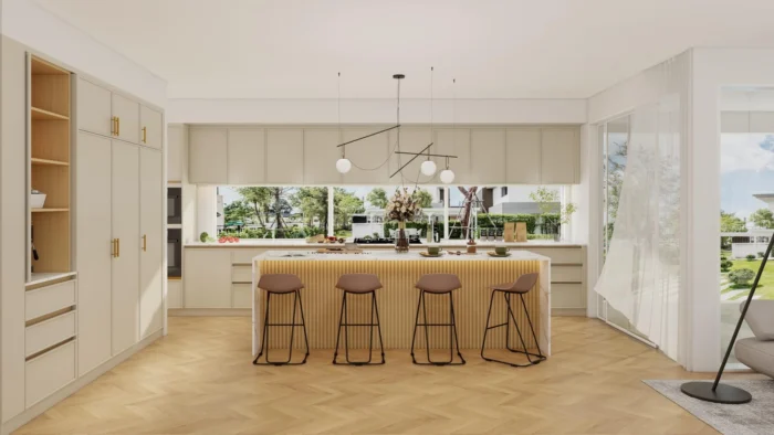
Most people agree: the kitchen is the heart of the home. It’s the center of our day-to-day lives and where
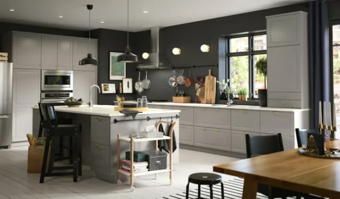
When it comes to renovating your kitchen, choosing the right cabinets is crucial. But with so many options available, how

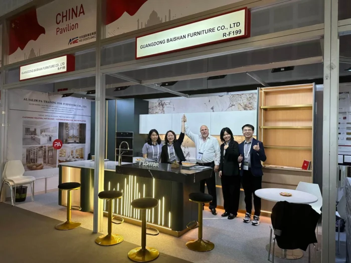
In 2022, we made forward together In 2023, we will continue to forge ahead The wind is strong and the